The Psychology of Color in Art
The Psychology of Color in Art
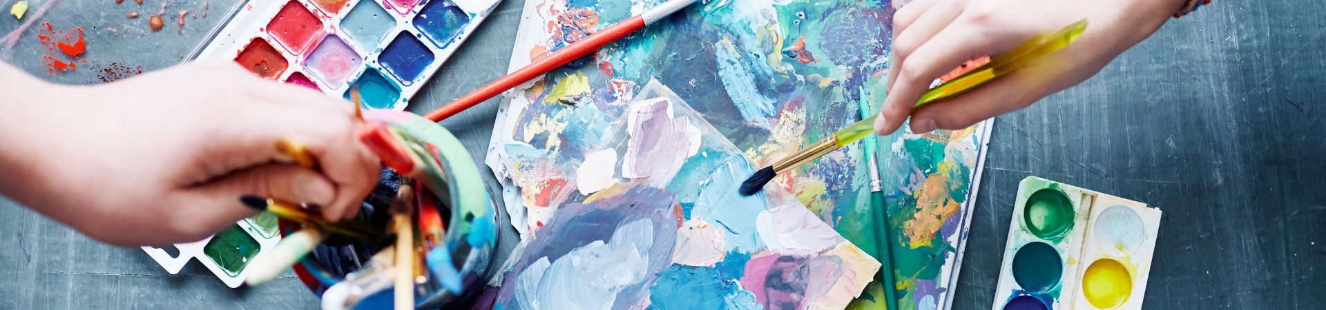
The psychology of color in art is a fascinating topic that has been explored by artists, designers, and psychologists for centuries. Color has the power to evoke emotions, convey meaning, and influence our mood and behavior. As the famous artist, Mark Rothko, once said, Color is a means of exerting a direct influence on the soul. Color is the keyboard, the eyes are the hammer, the soul is the piano with many strings. The artist is the hand that plays, touching one key or another, to cause vibrations in the soul. In this article, we'll delve into the world of color psychology and explore how different hues can be used to unleash emotions and influence creativity in art.
The Emotional Spectrum of Colors
Colors can be broadly categorized into different emotional spectrums, each evoking a unique response in the viewer. Red, for example, is often associated with passion, energy, and excitement. It's a color that can stimulate our senses and increase our heart rate. On the other hand, blue is often linked with calmness, trust, and serenity. It's a color that can soothe our minds and promote relaxation. As the color theorist, Josef Albers, once said, Color is a power which directly influences the soul. Color is the keyboard, the eyes are the hammers, the soul is the piano with many strings. By understanding the emotional connotations of different colors, artists can use them to create specific moods or atmospheres in their work.
The emotional spectrum of colors is not just limited to individual hues, but also to the way they interact with each other. Color harmony and contrast are essential principles in art, as they can create a sense of balance, tension, or harmony in a piece. For instance, complementary colors like blue and orange can create a sense of tension, while analogous colors like blue, green, and yellow can create a sense of harmony. By experimenting with different color combinations, artists can create a wide range of emotional responses in the viewer.

Color Harmony and Contrast
Color harmony refers to the way colors work together to create a visually appealing effect. It's a principle that's essential in art, as it can create a sense of balance, unity, and coherence in a piece. There are several principles of color harmony, including monochromatic, complementary, and analogous color schemes. Monochromatic color schemes, for example, use different shades of the same color to create a sense of unity and cohesion. Complementary color schemes, on the other hand, use colors that are opposite each other on the color wheel to create a sense of tension and contrast.
When it comes to color contrast, there are several ways to create visual interest in a piece. One way is to use contrasting colors, like black and white, to create a sense of drama and emphasis. Another way is to use contrasting textures, like smooth and rough, to add depth and dimension to a piece. By experimenting with different color combinations and textures, artists can create a wide range of visual effects that can engage and inspire the viewer. For example, some artists use the following techniques to create color contrast:
- Using warm and cool colors to create a sense of tension and balance
- Experimenting with different color saturations to create a sense of depth and dimension
- Creating a focal point in a piece using a bold, contrasting color
- Using color gradations to create a sense of movement and energy
The Psychology of Color in Art Movements
The psychology of color has played a significant role in various art movements throughout history. From the Impressionists to the Expressionists, artists have used color to convey their emotions, ideas, and experiences. The Impressionists, for example, used color to capture the fleeting effects of light and atmosphere in outdoor settings. They often used short, broken brushstrokes and vivid, unblended colors to create a sense of movement and immediacy in their work. As the artist, Claude Monet, once said, Color is my day-long obsession, joy and torment. The Expressionists, on the other hand, used color to express their inner emotions and experiences. They often used bold, vibrant colors and distorted forms to create a sense of tension and anxiety in their work.
The psychology of color has also played a significant role in modern and contemporary art. Many artists today use color to explore themes like identity, culture, and technology. They often use bold, bright colors and innovative materials to create interactive and immersive experiences that engage the viewer on multiple levels. By pushing the boundaries of color and art, these artists are able to create new and innovative ways of expressing themselves and connecting with their audience.
Practical Applications and Exercises
So, how can artists and designers apply the principles of color psychology in their work? One way is to experiment with different color combinations and palettes to create specific moods or atmospheres. Another way is to use color to create a sense of balance, harmony, or contrast in a piece. By understanding the emotional connotations of different colors, artists can use them to create a wide range of emotional responses in the viewer. For example, artists can use color to create a sense of calmness and relaxation in a piece, or to create a sense of energy and excitement.
To get started with color psychology, artists can try the following exercises:
- Create a color wheel and experiment with different color combinations to see how they interact with each other
- Use color to create a self-portrait or still-life piece that expresses your emotions and personality
- Design a color palette for a hypothetical art project or brand that conveys a specific message or mood
- Experiment with different color saturations and textures to add depth and dimension to a piece
Gaming Emotions Through Color
The psychology of color in art can also be observed in other forms of entertainment, such as digital games, where color plays a crucial role in evoking emotions and creating an immersive experience. Interestingly, the use of color in game design can be compared to the use of color in art, where both aim to elicit a specific emotional response from the player or viewer. For instance, a game that features a vibrant and dynamic color palette can create a sense of excitement and energy, much like a painting that uses bold and contrasting colors to evoke a sense of tension and drama. Players can experience this firsthand by trying out Dragonfate’s Favor slot online (Play’n GO), which offers a unique and captivating gaming experience. By exploring the psychology of color in different contexts, we can gain a deeper understanding of how color influences our emotions and behaviors, and how it can be used to create engaging and immersive experiences in various forms of entertainment.
Conclusion
The psychology of color in art is a fascinating topic that has the power to evoke emotions, convey meaning, and influence our mood and behavior. By understanding the emotional connotations of different colors, artists can use them to create specific moods or atmospheres in their work. Whether you're an artist, designer, or simply someone who appreciates the beauty of color, the psychology of color in art is an essential principle to explore and understand. As the artist, Paul Klee, once said, Color and I are one. I am a painter. By embracing the power of color and its emotional significance, we can create art that inspires, uplifts, and connects us on a deeper level.